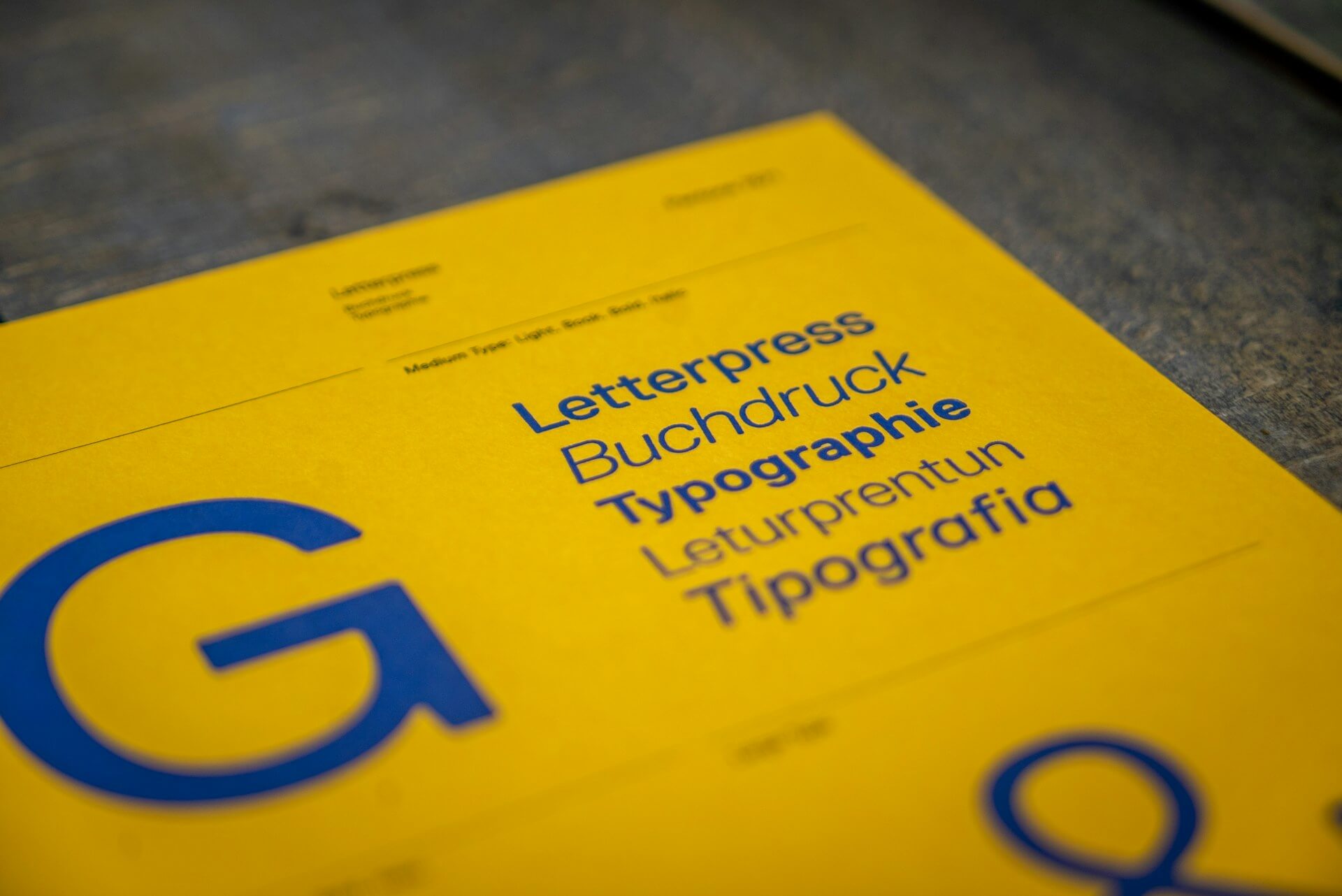
Typography is much more than just an aesthetic detail in web design. It directly influences how visitors consume content and interact with a webpage. Choosing the right fonts, sizes, and spacing can make the difference between a pleasant and intuitive site or a frustrating user experience.
In this article, we will explore how typography impacts usability and share essential tips to enhance readability on your website.
1. Legibility vs. Readability: What’s the Difference?
Legibility
Legibility refers to how easily individual letters and characters can be recognized. To ensure users can read the text effortlessly, it’s crucial to select well-designed fonts with clear strokes and good character distinction.
Readability
Readability goes beyond legibility and focuses on how comfortable it is to read long passages of text. Factors such as word and line spacing, content organization, and contrast play a significant role in reading flow and user comfort.
2. How to Choose the Right Font?
Serif or Sans Serif?
The type of font you choose significantly impacts digital reading:
- Serif Fonts (e.g., Times New Roman, Georgia) have a classic, traditional look, making them ideal for long and formal texts.
- Sans Serif Fonts (e.g., Arial, Helvetica, Roboto) are modern, clean, and minimalist, making them perfect for digital reading.
Custom Fonts
Many brands create custom fonts to strengthen their visual identity, but it is essential to ensure they are readable and compatible with different devices.
3. Text Size and Visual Hierarchy
Font size directly affects user experience. Best practices include:
- Headings: Should stand out with sizes above 24px.
- Body text: The ideal range is between 16px and 18px for comfortable reading.
- Buttons & CTAs: Should be highly visible and easy to interact with.
Using different font weights and sizes helps create a clear visual hierarchy, making navigation easier for users.
4. Spacing & Alignment: Avoid Visual Fatigue
Proper spacing makes reading smoother and prevents eye strain:
- Line spacing (line-height): Should be between 1.4x and 1.6x of the text size.
- Letter spacing (letter-spacing): Small adjustments can enhance readability in certain contexts.
- Alignment: For long texts, left-aligned text is the best option as it facilitates reading.
5. Contrast & Accessibility
The relationship between text color and background determines whether the content will be easy to read:
✅ Follow WCAG accessibility guidelines to ensure sufficient contrast.
❌ Avoid light text on white backgrounds or overly vibrant colors that hinder readability.
🛠 Tools like Contrast Checker help validate legibility and accessibility.
6. Performance & Optimization: How to Avoid a Slow Website?
Using too many external fonts can slow down your website. To optimize performance:
- Use only essential fonts.
- Prefer optimized formats like WOFF2.
- Load fonts asynchronously to prevent rendering delays.
Conclusion
Typography is a key element in web design, impacting both aesthetics and usability. Choosing the right fonts, defining a clear hierarchy, and ensuring good contrast are fundamental steps to enhancing the user experience.
At Byte to IT, we create websites that combine functionality with an attractive design. Want to ensure your site’s typography is optimized for the best experience? Get in touch with us! 🚀


